Branding Design
CASHRENT.COM
Logo Design – Brand Story – Interface Design
A brilliant software idea, without a clean and intelligible presentation
will fail in the marketplace.
I was task with a 10 week branding, interface, market reasearch, budget planning and user testing project in the launch of CashRent.com
GOOD BRANDING CONVEYS STORY
STORY IS MY SPECIALTY
As a graphic designer, building the understated elements of story into my designs brings them to life. But in the initial logo designs from an online marketplace, the logos we trite with the obvious story. Overliteral to cause assumptions about what our SAS product provided as service. Bringing a complex relational database service that informs the customer while connecting new buyers in the marketplace was not an obvious farming story. SO the branding needed to get past the obvious farm icons.
A moodboard helps define a direction beyond just a graphic treatment – into the realm of the attending story that can be used to convey the mood, messaging and direction the brand is to carry. Read further to see the exact logos that were a first round of presentation from an online graphics service.
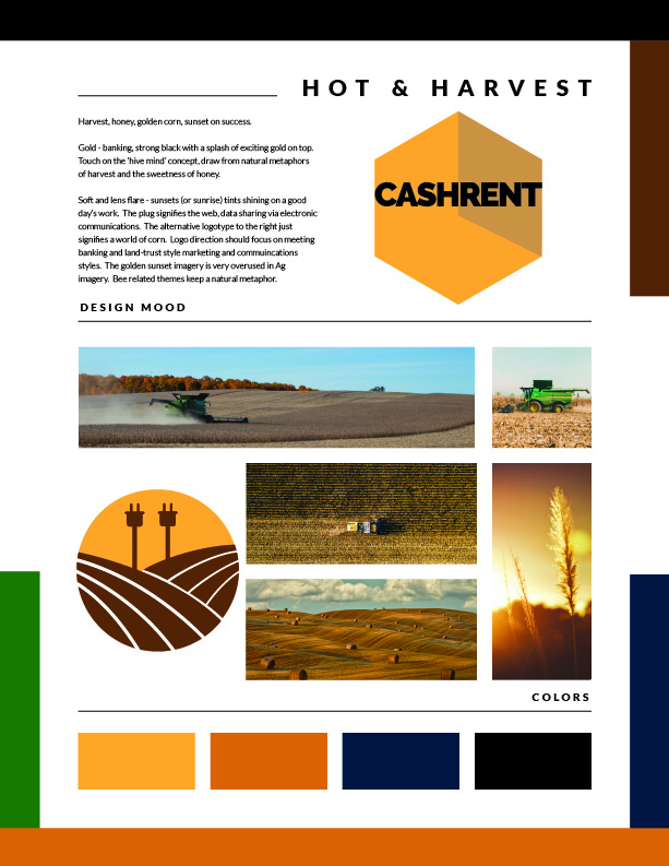
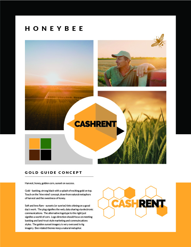
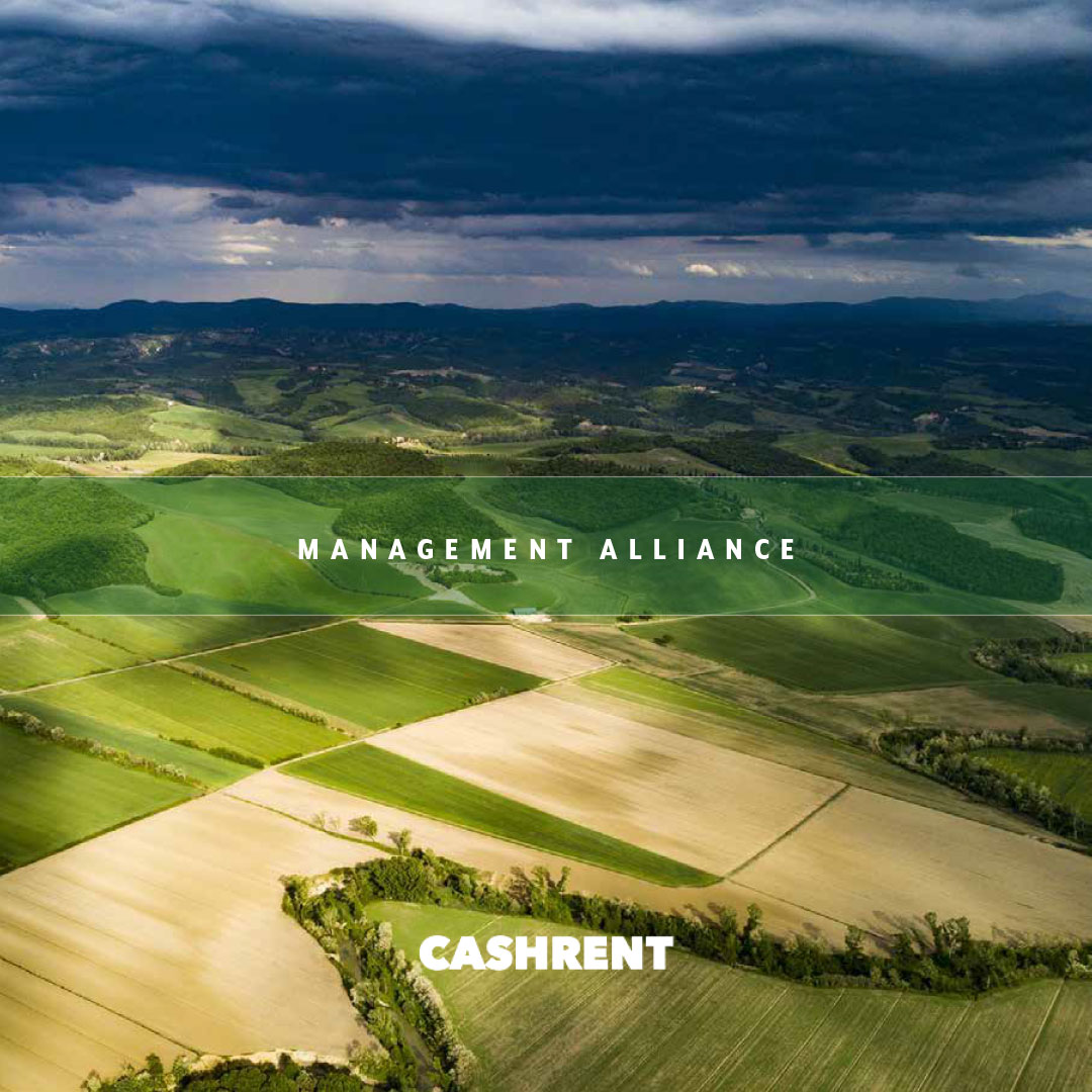
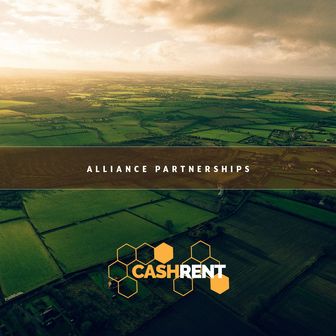
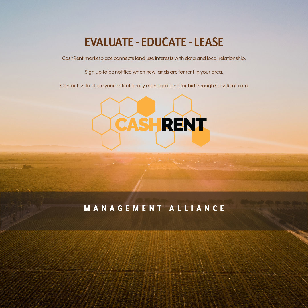
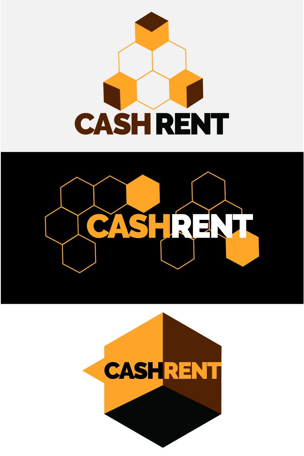
To help distinguish our story – without committing to either of the two main branding direcctions I had developed – we moved the brand message into our initial outreach to a brochure for institutional investors. Option 1 “spring” and Option 2 “honeybee”:
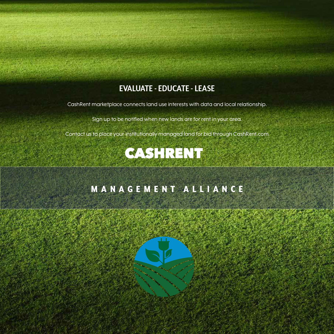
The hexagonal design element of a honeycomb carries the popular gold and black branding color combination into a different storyline as it incompases the ideals of the industrious, cooperative and ecologically neccessary honeybee. The founders liked the subtle hook and the decision was made. A short run print job reached the decision makers doing the institutional land management in time for the 2019 decision making process.
DEFINING A LOGO
Takes time and careful consideration. Yes, an online source can deliver a few graphics in a few minutes, but a brand that will last, get trademark approval, and stand out in the marketplace is a concentrated effort at simplification:
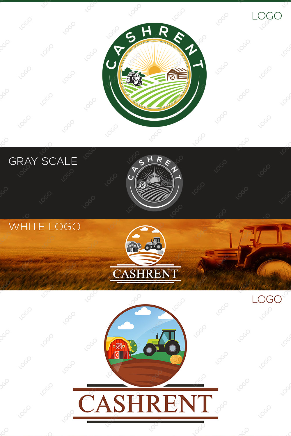
ONLINE GENERIC
Produced by an online graphic design source this panopoly of options that use a variety of overly obvious illustrations and metaphors.
Neil’s Designs
Born from several weeks of market research, a few hours on the drawing board and a little creativity born from subconscious dream state – a shape emerges.
BOARDROOM APPROVED
The choice never rests with the designer, my job is presenting options – the choice by the board defines the storyline and energy spectrum.
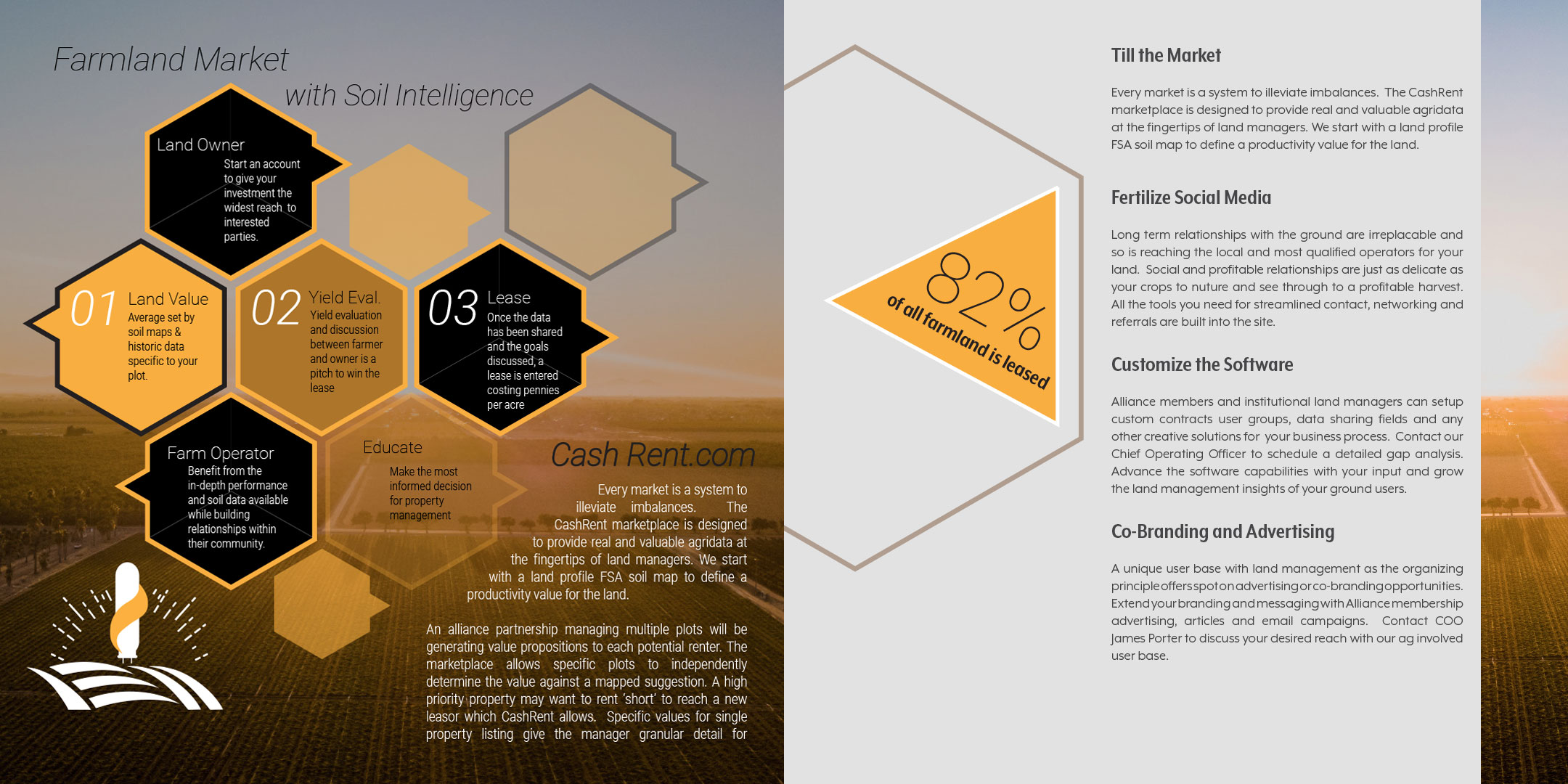
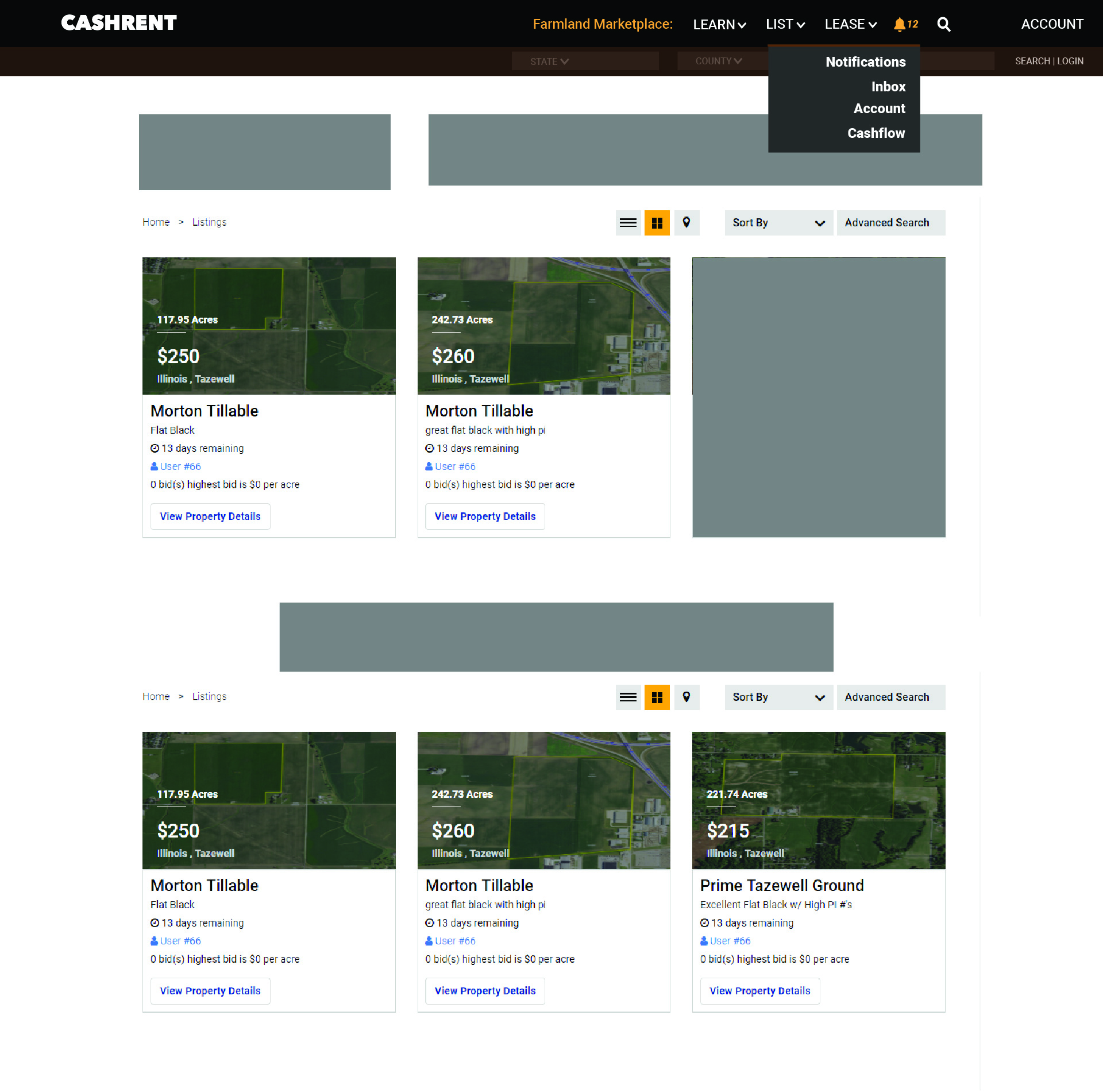
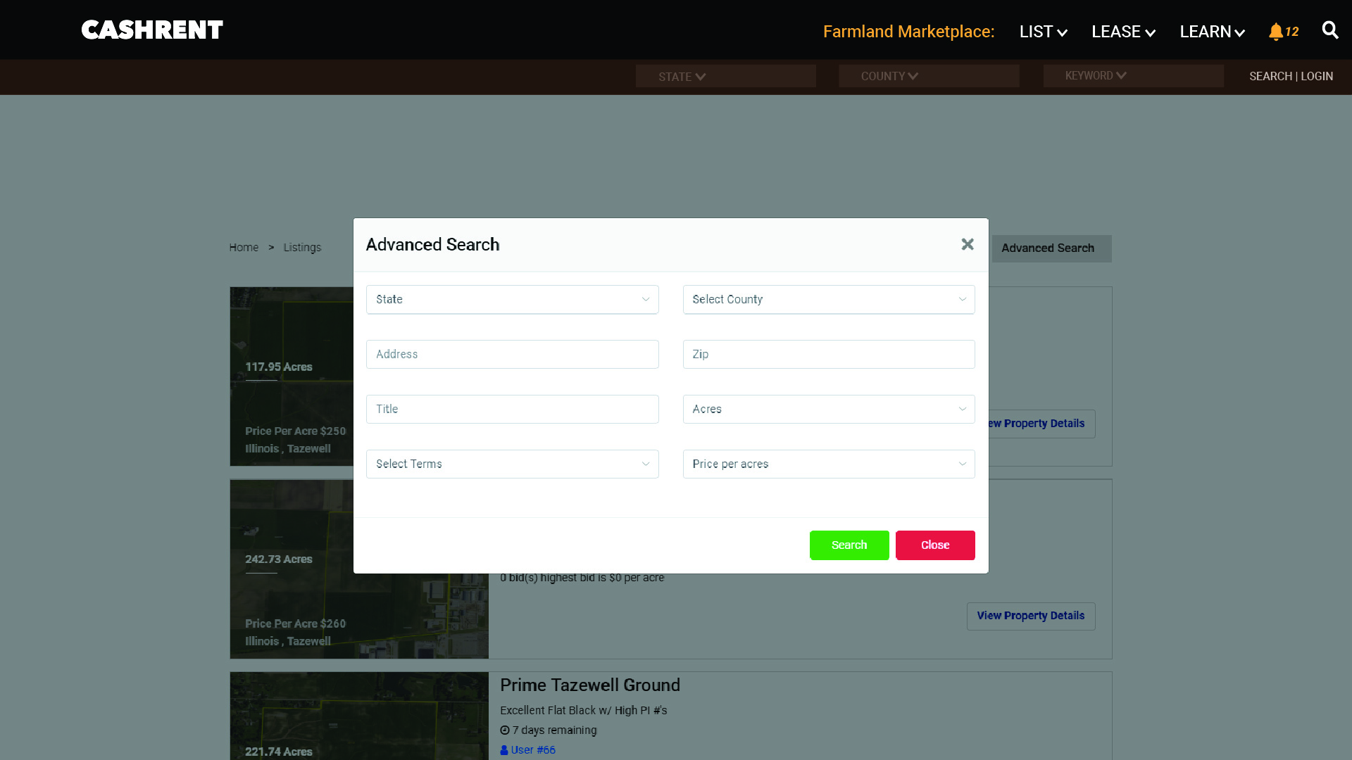
UI / UX
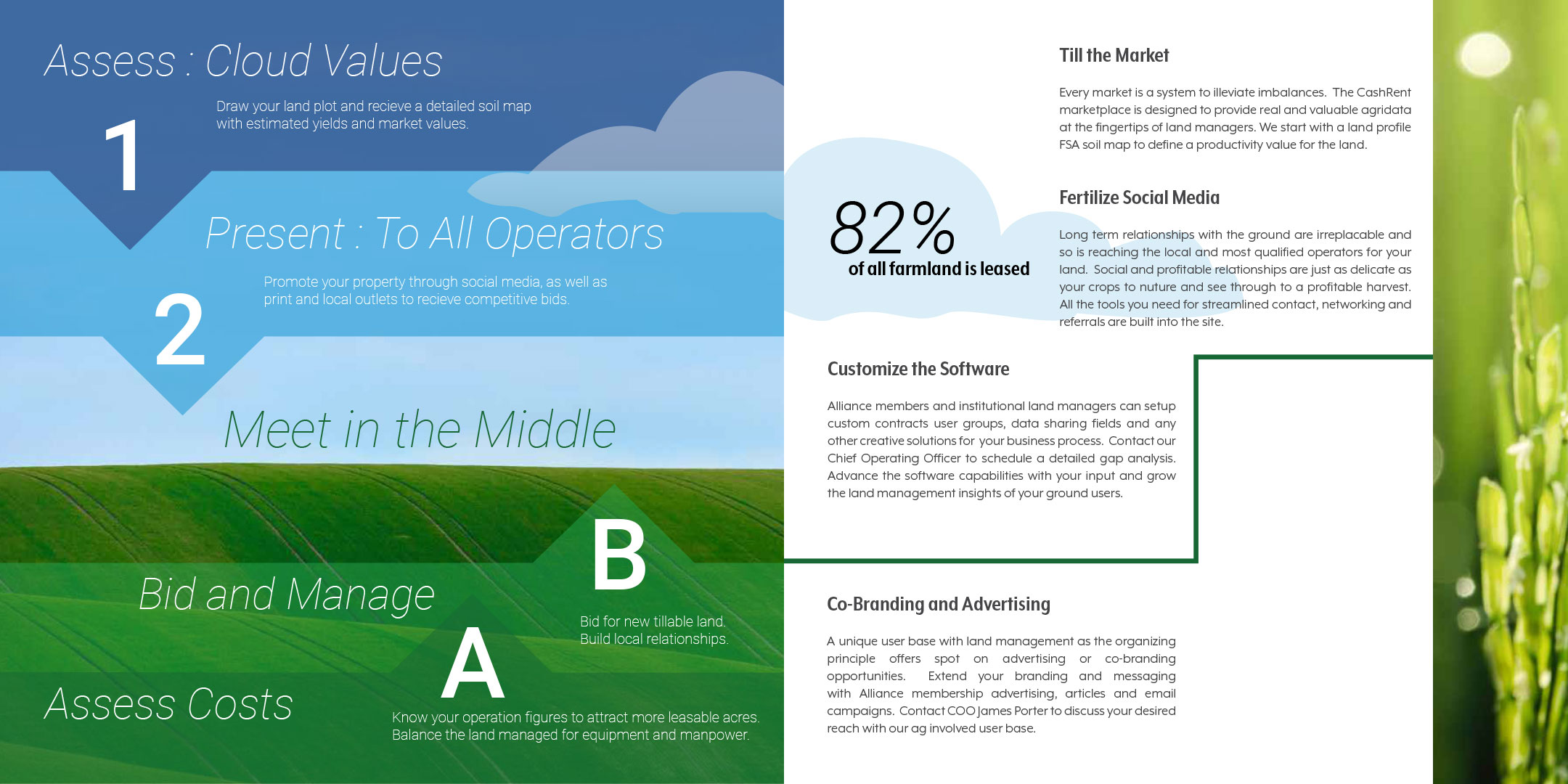
User Interfacea and User Experience for a wildly diverse demographic. Farmers in middle america commonly in the 40-70 year old age range as decision makers on land use issues. Plus, upper management institutional land owners in the land leasing management chain. The most favorited device among farmers = iPad. The desktop computer most used in the office environment.
CARRYING A BABY BRAND
INTO VIDEO
For a brand test and example media quick explainer videos were produced: