7 years of branding and design
I don’t know many people who have dedicated 7 years to taking small things, and turning them into big things.
James Harrington met a guy from Uganda, and turned it into his life’s purpose.
The Ugandan Water Project was born from the seed of a small meeting, but it’s hard for us American’s surrounded by waste and excess to understand how to build a business that only runs on 20% of it’s capitol. It’s hard for us to understand the amount of integrity and dedication and scrutiny that requires. James had pinched pennies for 7 years before he was wiling to take a professional to Uganda to showcase the real work they were doing – because even the airfare to take me there – would provide clean drinking water to 400 people for 10 years.
But in 2013, 7 years after helping James setup his first website – and guiding the formation of a brand for a non-profit. I was able to travel to Uganda to help communicate the real work that happens on the ground.
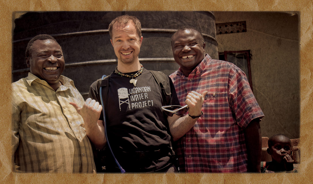
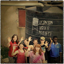
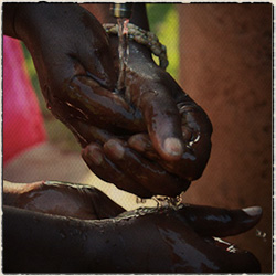
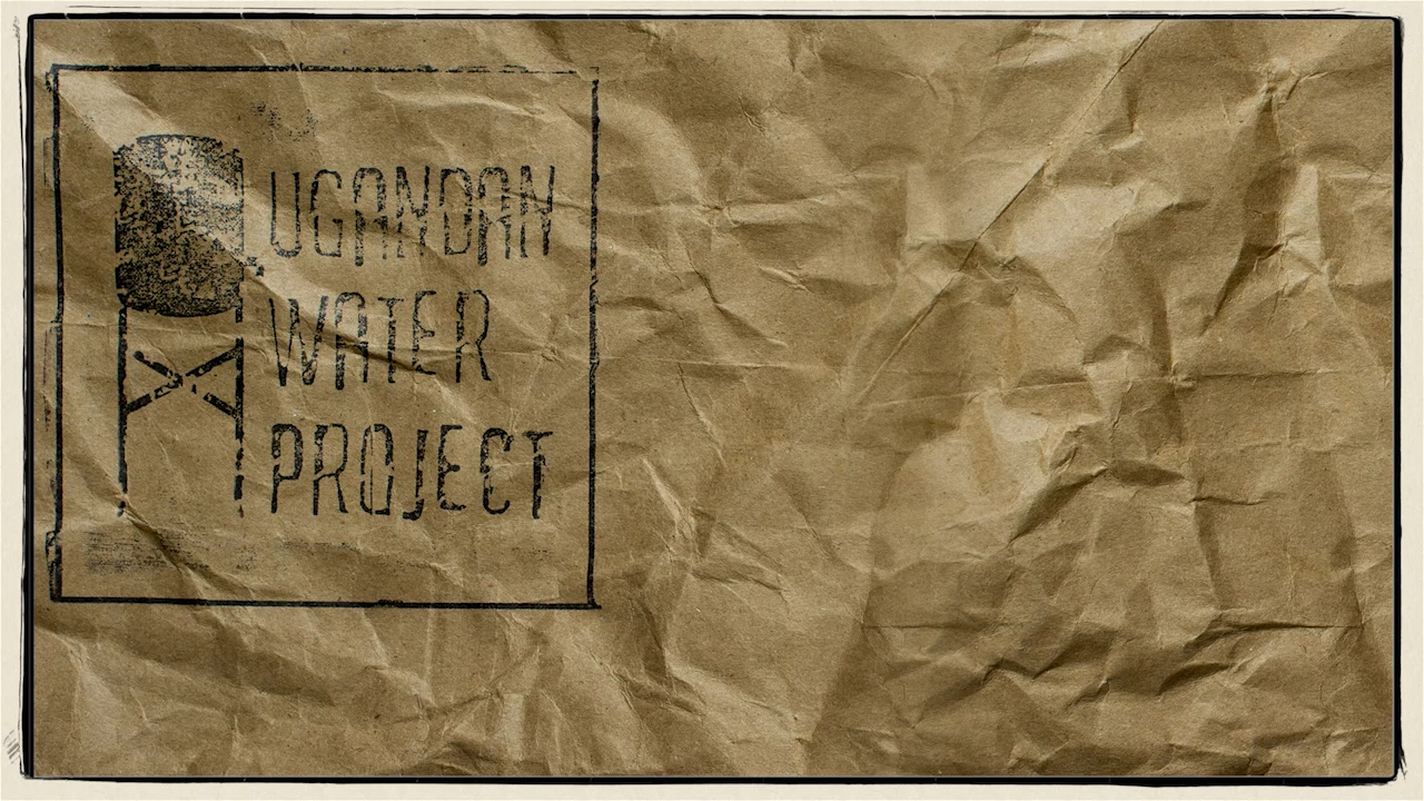
The Video frame was part of the branding package. The website’s background texture was framed by an old fashioned 35mm film frame. All of the communications materials were printed on the brown paper bag style paper. That’s James’ hand, stamping the logo on the paper bag. All these elements coalesced into a completely candid, joyful, video presentation of the work they were doing in rural Uganda.
Capturing Essence in Video
You’ve seen the ad’s on TV right – help feed the starving children of africa. Well, we now understand those ad’s to be placing the children in the victim’s role – and it’s bad for them – and bad for us. A book that James Makes you read before you to understand the full ethics of the situation is “When Helping Hurts” by
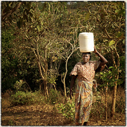
The essence of what the Ugandan Water Project is trying to create, is healthy communities. Showing their joy around chasing a soccer ball – that we brought to delight them – is more the essense of their community than their sorrow. Sharing their joy and successes are more important than sharing their sorrows.
Sometimes they go without water, sometimes they go without food – but their spirits are only stronger for it.
Let’s celebrate success rather than victim stance and pity party.
This 3min video allowed James to stand before a croud of 100, or 300 and communicate his organizations goals, values and essence!
Production Details
Neil solo in the field with responsibility for all audio and visual recording. 2-4 hour van rides to remote villages where we were able to stop for less than an hour. So each location only received minimal coverage so that we could reach as many locations as possible. I was shooting a Canon 5D on custom rig at the time.
Neil designed our first website and would always lovingly add his expert eye to our mailing and publications. He always took the time to help me learn what he was seeing, or how it would help communications rather than just show me he could do it better. When I took the leap to full time involvement and supporting my family totally from this endeavor, Neil was there to do strategic thinking, branding and opportunity identification.
He partnered with me in reaching donors as effectively as consumers, and helped me communicate those emotional cues that are the motivation for donating or purchasing. Neil was also able to utilize common print formats to allow us to give away print pieces and mail effective communications that had a cohesive style and message on our minuscule budget.
In 2010 I hired a small team of student filmmakers to come to Uganda and work with me on getting effective video pieces together. Unfortunately, they didn’t have a vision that connected with me or our donors and so I was very hesitant to spend to get Neil to Uganda in 2013 for the same purpose. How could he do better than a team with fresh college degrees? But he did – the leader piece above was the first successful 3min video that shows what we do, and the people of Uganda in their natural state without overt or manipulative ‘tone’. These video pieces helped introduce me to fundraising audiences as I was invited to speak in schools and churches across the country. The dollar impact is impossible to track, but if I reverse engineer marketing nubmers – Neil’s efforts put about 10 tanks a year on the ground in Uganda. That’s 4000+ people per year gaining access to clean safe drinking water.
Vertigo Sky Bar – live event fundraising
$5000 raised in one night
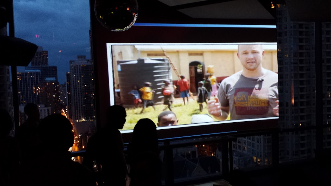
The picture headlining this article and shown here at the left is my video playing to a crowd of 500 on a rooftop event space in Chicago. We raised enough funding to provide clean drinking water to 4-600 individuals in rural Uganda at an after work mixer for Chicago professionals. What an inspiring evening for them, and us! The 3min video mark is just enough time to quiet a large room and give them the gist of what we do and who we serve before James get’s up to make an in-person pitch. We met the ONE Campaign Director for the Midwest who’s name was memorable since it was Tzviatko at the event and he was blown away by the professionalism of our branded fair trade goods table and video presentation put on by a two man show.
According to Malcom Gladwell, in “David & Goliath” :
“It is because of, and not despite, David’s size and unorthodox choice of weapon that he is able to slay the lumbering giant. In other words, Gladwell says, most people underestimate the importance of agility and speed. ‘Things that we have thought were real advantages actually aren’t, and things that we think of as overwhelming obstacles actually are incredibly useful.”
A one-man creative team is incredibly agile and fast moving. If the branding is built in my head – there’s no transition to my pen, my camera, or my designs. The advantage for your small or growing mid-sized business are the removal of communication loops, time to execution and less touch points to finished. Give me a call to talk through your needs.
Branding on Business Cards
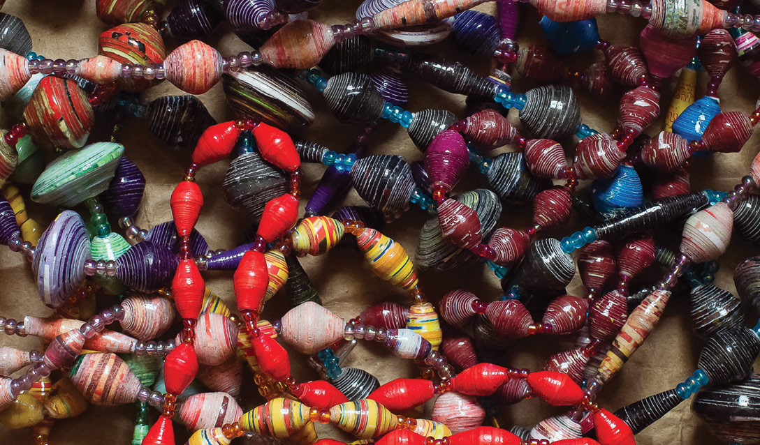
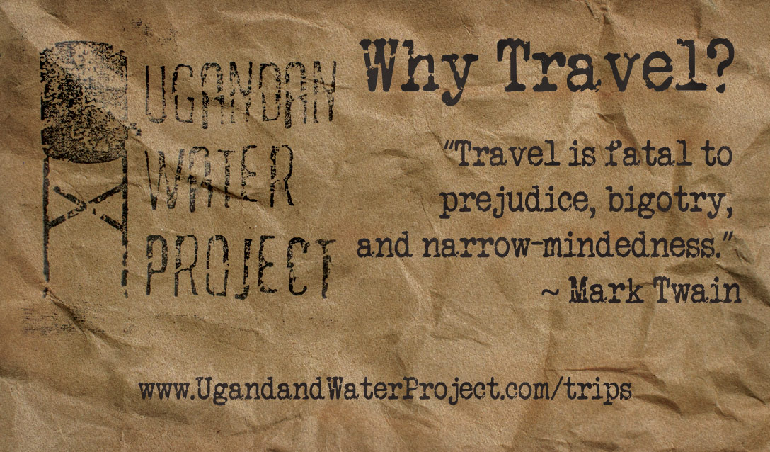
Table talk moved the business model forward. James and his volunteers hold a unique and ever present community presence by selling beads made in Uganda to US craft fairs. These cheap and disposable cards show a clever use of community interaction to turn a touchpoint from sales to volunteerism.
Business cards who’s messaging tackled all the main questions and oportunities in the organization. The cards cost way less than online impression costs, and carry the richness of in-person conversation into the pocket and future consideration of possible volunteers.
The Goal is to Get Volunteers to Africa
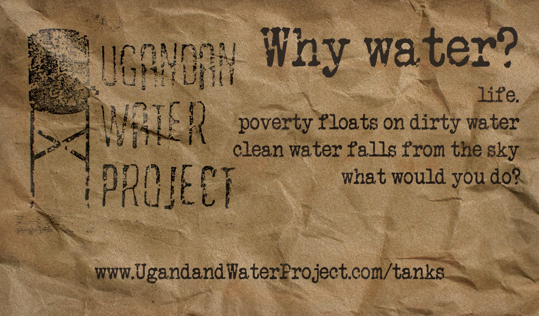
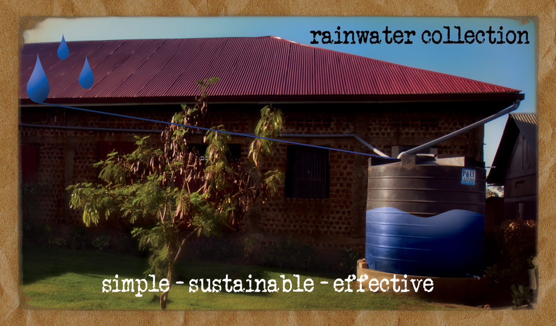
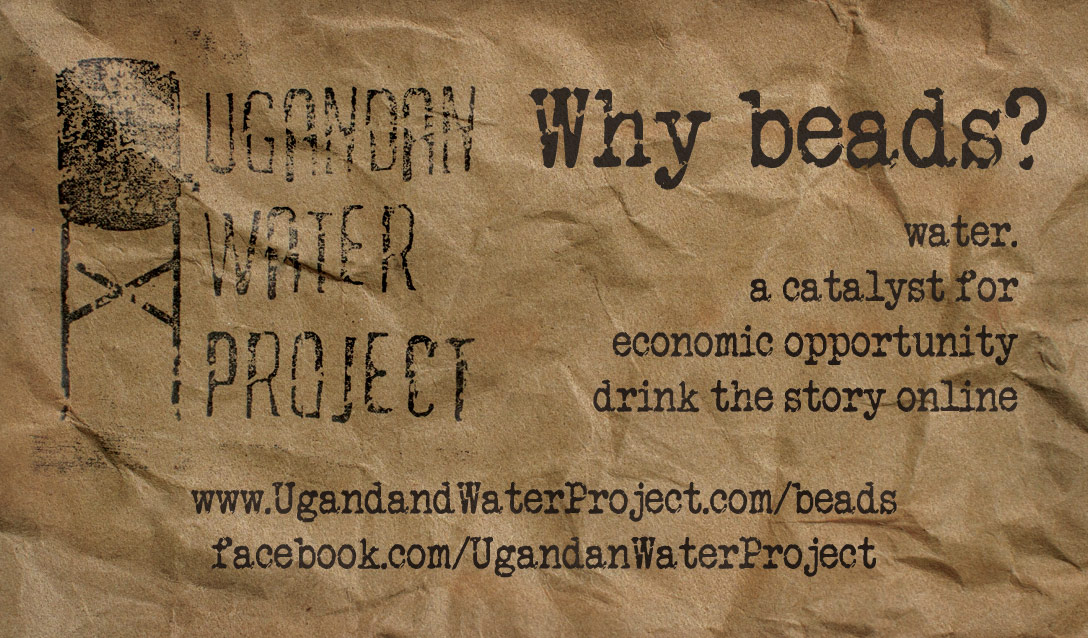
These cards took the interested learner
into the volunteer’s story while talking at the booth.
A physical touchpoint to carry an in person conversation
into :giving or going.
Branding on Brown Craft Paper
Al designs must be completed with the tools at hand.
Within budget.
For a startup non-profit, my design capabilities had to reach within, the budget. So we regressed to a rubber stamp – that placed the return address on each envelope sent out with the hand-cut lettering shown in the design and a handmade mark. The quarterly newsletter had to go out to a mailing list so small only a one-color lazerjet printer would be economically feasable.
So choose a different paper stock!
The availability and affordability of brown craft paper made an instantly noticable distinction in our mailed materials. The fact the material carried a warmth and practicality of rural Uganda was on brand for us. We designed the update and fundraising letters in an American Typewriter font in which I’m writing now – harkening back to a typewriter dispatch from the field of early journalism. Remember this is 2011, so Instagram tiles heavy in ‘typewriter’ font wasn’t a thing yet.
When a newsletter that arrives like a handmade art project in your mailbox – we hoped you’d cherish it with all the love we put into creating the content. The departure from paper stock kept our mailing from feeling like just another bill or mass mailing, all for the cost of loading your own paper at Kinko’s!
The Video opens with a physical effect, and uses the crumpled craft paper to present any title texts so that we retain a handmade feel (in the photograph of the stamp) while quickly creating typographic effects in the handmade veign.
View more of my Branding Design Projects to see other manifestations of style and content.
